IXD 301
Designing with content.
Portfolio Project.
For my portfolio site, I thought I would put together a design that showcased the skills I have learnt over the last few months, including javascript components, flexbox frameworks and scrolling-based interactions.
The overall design came from wanting to reflect the various different styles that I produce in my work, while retaining elements of my personality throughout the content. I primarily wanted to include different interactive elements including micro-interactions and scrolling interactions, and provide really nice visuals for the user.
The website is built using the Jekyll framework, utilising '_includes' and '_layouts' for the different page layouts, Materialize.css for javascript components and Flexbox Grid for fluid responsive layout.
Introduction Section
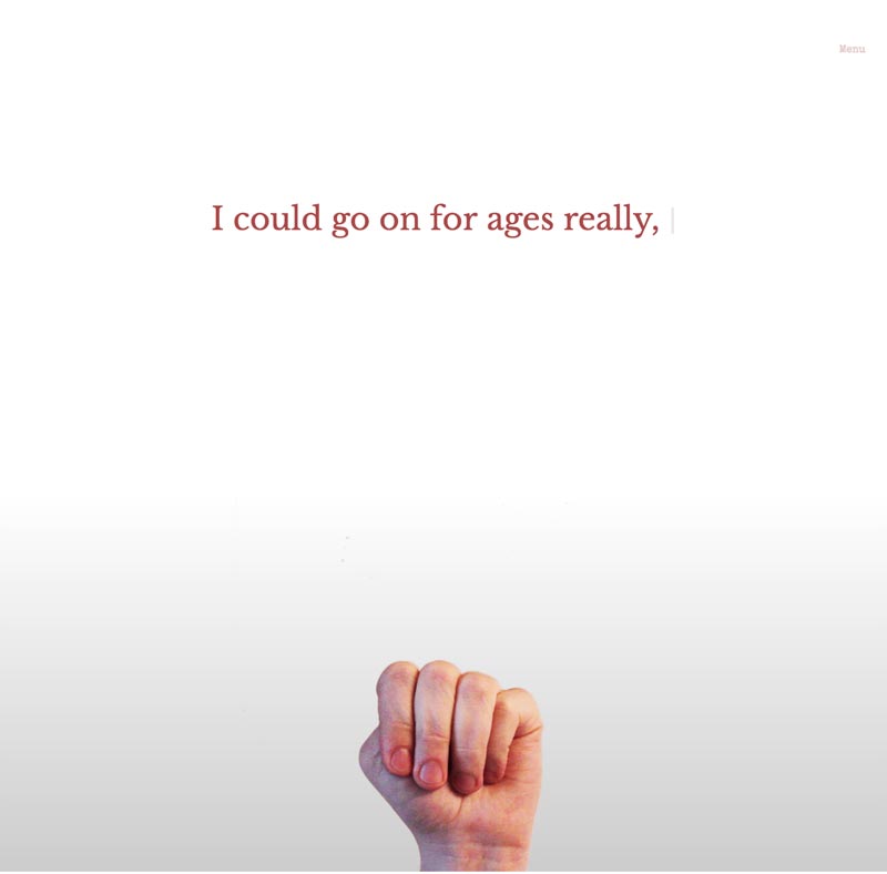
The introduction section contains too different interactions that I really wanted to use within my projects. The first is typed.js, which creates the typing animation, and the second is a scroll-based image sequence created using Scrollmagic.
I customised the typeface and colours for the typed.js CSS properties, using the 'Libre Baskerville' typeface. Although this is the only time I use this typeface on the website, I felt it worked really well with the animation and style of the section.
To build the scrolling animation, I recorded different hand gestures and turned the video into an image sequence on photoshop. With about forty layers, I removed the background from the images, in order to create a transparent PNG image, enabling a customised background colour through CSS. Once I had exported the sequence, I then set up the image sequence Scrollmagic settings with the HTML, CSS & JS, and imported the images into the website. What you're left with, is an interactive animation completely controlled through scrolling interaction.
One thing I did notice was the slow loading times of the images within the sequence, due to their PNG filesize. To optimise this, I would recreate the sequence as JPEG images, reducing the overall file and and loading times, with the only compromise being the set background colour depending on the background chosen while building the sequence.
Case Study Sections
For the case study sections, I decided to choose fullscreen parallax images, built with Materialize.css and use Scrollmagic to animate the corresponding case study logos.
For each case study there is a relevant link below the main parallax image, using hover.css to animate the case study links to create the desired effect.
Typography
The typography on the website uses three typefaces, 'Libre Baskerville' for the introduction section, 'Josefin Slab' for the headings and 'Special Elite' for the body text. All three fonts can be found on Google Fonts, and I really liked how these typefaces paired well together. Although I only use the 'Libre Baskerville' typeface once on the introduction section, I feel it works well against the other typefaces on the website.
Artwork
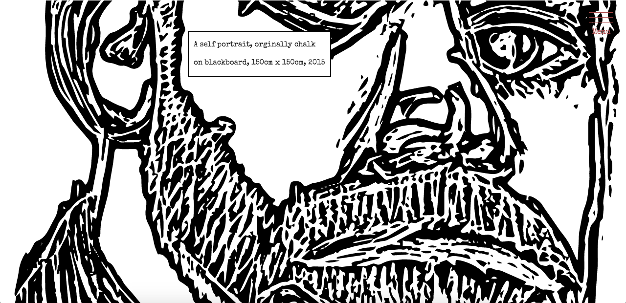
To break up the different sections, I decided to use various pieces of artwork I have created, which I think work well to add a bit more grit to the site overall. The artwork was each placed inside parallax containers, along with a comment box, animated by Scrollmagic.
Content
I order to create the fade-in / fade-out effect when navigating to different pages, I created a wrapper for all the content and assigned an 'animstion' class to it. I found Animstion, a jquery plugin, which allowed me to animate the page transition when applied to both a container and relevant link.
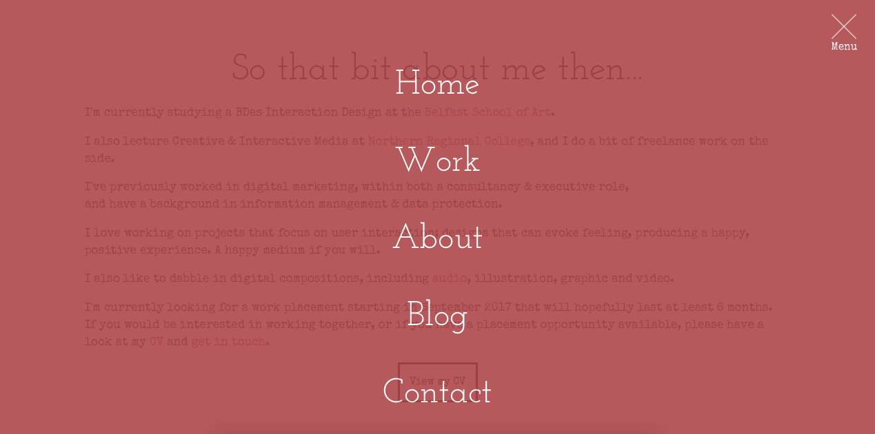
The Navigation
I found the structure for the main navigation on codepen.io, and which a bit of tweaking, customised the menu to better suit the website. I added the animated hover link using hover.css and changed the colour to match the website colour scheme. I really like the effect and animation properties the navigation has, and think it works well with the overall design. I also used Scrollmagic scrolling interaction to change the class and colour of the menu whenever it scrolls over different sections of the website.
I really like how the portfolio website turned out, and think the visuals work really well in terms of graphics and typography. The only main issue I found was that on mobile, the main index and blog index page both seemed to stretch outside their defined width of 100%. I am still looking into this issue and trying to correct it, working my way through the CSS in order to discover the issue.